Sometimes we just don’t read the directions
Thanks to some eye-opening user research, we’re re-thinking our how-to pages.
The majority of the content we publish on Boston.gov is there to help you accomplish something. We also have specific pages that we refer to as “how-to guides” for situations that require a specific set of instructions, such as “How to pay a parking ticket” (a crowd pleaser). The truth is, though, that if we don’t present those instructions in a helpful and effective way, well then we haven’t accomplished much! We’re always looking to get better at the Digital Team. Whether it’s improving digital communications or building better online tools, we’re interested in creating a more engaging experience for our users that improves over time.
While we’ve done some user testing in the past, we don’t have anyone on our staff who is solely focused on user experience just yet. That’s why we jumped at the chance to work with a team of students from General Assembly on a user experience project. The blog post below was written by the students about their findings.
Getting started
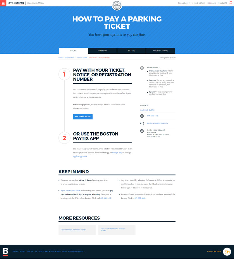
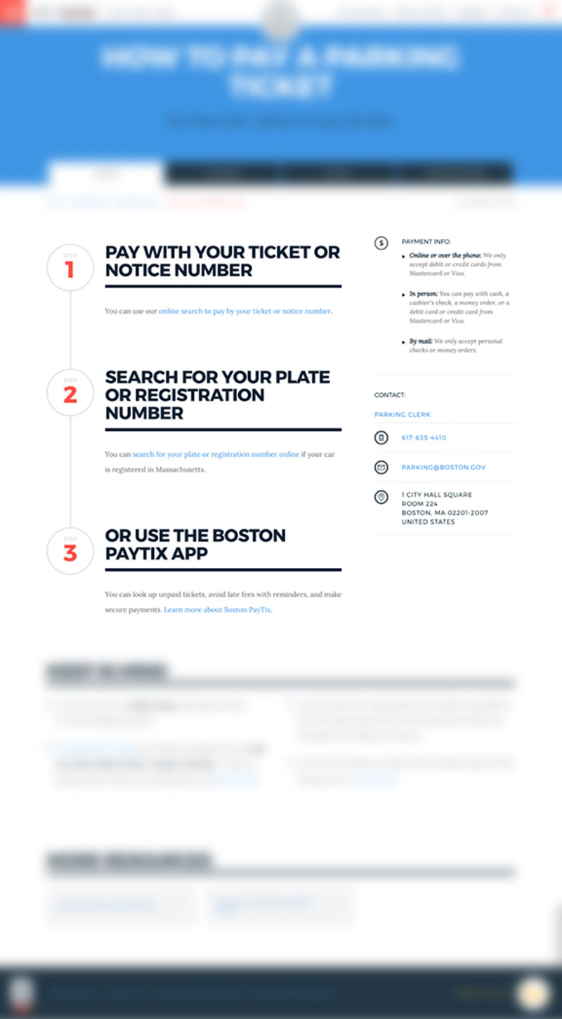
After first meeting with the Digital Team, we explored a few different options for our potential project. In the end, we decided to focus on Boston.gov’s “how-to” pages. Given it’s high traffic, we redesigned “How to pay a parking ticket.”
We were determined to converse with and test variations with a variety of people, because our “target user” could literally be anyone. By the end of our project, we ran 59 usability tests in total, split between the current site and our redesign. Thanks to our efforts, we were able to gain insights that could apply across all pages on Boston.gov. This focus on iterative testing led us to a design that we were confident would be more usable for people using Boston.gov for their tasks.
Our user? The people
When it comes to civic tech, there is not a specific “persona.” We could stand in the middle of Boston Common pointing at anyone who walked by, and every single one of those people could be our user. So, we decided to create a design that would benefit everyone. By designing for accessibility, our approach was simple.
If we explicitly targeted people who struggle the most with the site, we could design something that everyone could use.
In our research, we worked with Little Brothers Boston, the Legal Services Center, and Tech Goes Home. They helped us reach crucial populations that are often technologically disenfranchised.
Our process and tools
We only had three weeks to work on our project, so we used past research and analysis on Boston.gov to ground ourselves. We didn’t want to waste any time discovering issues that were already known, and findings that were already found.
The first step was to hold some informal conversations with people in the field. We went to City Hall to figure out why these folks were paying their parking tickets and completing other tasks in person, rather than doing them online.
Start of testingThere were two types of people that we ran into at City Hall:
- people who will never go online to do things, and
- people convinced what they needed to do wasn’t on Boston.gov, or couldn’t find how to do it.
We analyzed the “How to pay a parking ticket” page with 15 different people, giving participants two tasks.
- First, we asked them to go through the process of paying a parking ticket online and by mail.
- Then, we challenged them to find important pieces of information, such as payment methods and details about late fees.
People weren’t having trouble finding the “How to Pay a Parking Ticket” page, but they were having trouble navigating the page itself. The information is all there, but people were just not seeing what they needed to see to accomplish their goals without mistakes and errors. One cause of this was a behavior? Scanning.
According to Nielsen Norman studies, 79 percent of people scan when reading on the web. Only 16 percent read word-for-word.
Most people are scanning a site’s content instead of actually reading it. With that tendency, people are bound to miss important information and make mistakes. But, we also found that the general design of the page was creating issues for people. The way information and contact details are displayed, along with the location and placement of tabs, created issues for people.
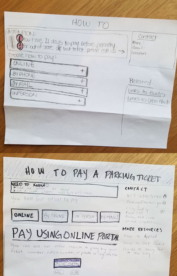
Success with accordionsAfter we nailed down the problem, it was time to ideate and brainstorm the solution. Through this process, we came up with rough sketches of accordions and buttons to test:
We user tested these new designs with 15 different people, giving them the task of paying a parking ticket online on both prototypes. At the end of each, we asked them which one they thought was easier to use, kind of as an informal A/B test.
Our accordions layout was overwhelmingly easier to use than buttons in our tests. Users appreciated accordions because it made them feel like they knew their options better. The accordions laid out information in a vertical way that made them make a choice in order to start their task. We digitized the design, and then tested that with 29 new participants.
Potential areas for change
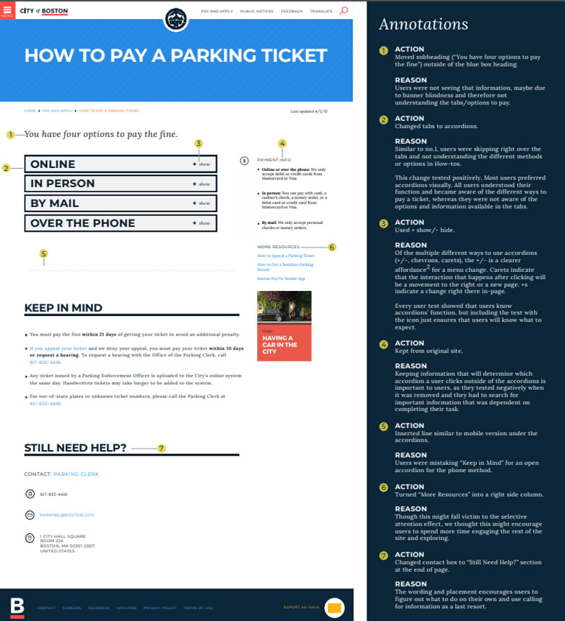
We found five places on the page where changes would have a big impact:
The subtitleWe took the subtitle “you have four options to pay the fine” out of the big blue header. It just wasn’t being seen by users.
TabsWe turned tabs into accordions. They weren’t being seen by users or functioning in an efficient way to display the options.
Information placementWe put information necessary for the task — such as payment methods accepted — in more relevant locations.
Contact informationWe moved the contact information to the bottom of the page. We also added a heading above it that says, “Still need help?”
More resourcesWe moved this section from the bottom of the page to the right hand column above the fold. We wanted to encourage users to explore the rest of Boston.gov’s helpful content.
Problems and solutions
Addressing the scanning
I’m like everybody else. I don’t read the directions.
Boston.gov already does a good job with digestible information, and all the information people need to know is actually all there. But, our initial usability tests on the original site showed users were still scanning and missing the important information. This is a larger issue that is not specific to Boston.gov visitors, but we still needed to find some kind of way to address it.
To tackle the scanning issue, we leaned on progressive disclosure. What is progressive disclosure? Nielsen Norman explains its as placing rarely used features or secondary information to a secondary screen. This makes applications easier to learn and less prone to errors.
By displaying tabs as accordions, we redistribute the information to be hidden from users until they are ready to see it. Accordions forced users to slow down, reduce scanning, and read what was in front of them.
Letting the F-shape guide usIt’s been uncovered through eye tracking studies that users often scan in the shape of an F. Though we didn’t have eye tracking capabilities, we matched up the general F-shape with the words users were reading aloud, and the path their mouse moved in some cases. We found some areas where users could be missing information on the current site:
- the “need to know” information on the right hand side of the page, and
- the “keep in mind” section at the bottom.
Users eyes’ might not travel to those sections unless they absolutely have to. By that time, they might be fatigued, which makes readability worse. When the full page was presented to users, they were most likely seeing something like this:
Even though the F-shape was a problem, it helped direct us during our layout and visual and information hierarchy exercises. We used this F-shape to combat the problem of scanning and users missing information.
Accordions disrupted the F-shape, and broke up the walls of text that cause users to scan in that shape. With accordions, users weren’t as overwhelmed by a full page of text. Using the F-shape, we plucked the instructional subtitle out of the blue header. We put it as the first piece of content, above the accordions and left-aligned, so it matches up with the F-shape as the first thing to be seen.
We also used the F-shape and point of need as guidance for our relocation of the contact information. We put it at the bottom of the page and at the very bottom of the F-shape, under the heading, “Still need help?” This location and language combination helped empower our users. They were able to take care of their tasks and transactions without having to use that contact information. That language tells users that everything they need is right there on the page, they just need to look.
Selective attention and banner blindnessUsers subconsciously look past anything on a page that resembles, is close in proximity to, or appears in locations traditionally dedicated to ads or big decorative photos. This means users often skip right over headers and big images at the top of the page. So, anything inside the blue box at the top of the page — such as the tabs or instructions — is likely to be missed. Our first round of testing on the current site validated this behavior was present and consistent.
To address this banner blindness, we focused on the point of need. The point of need is the moment when a specific piece of information is required to continue or finish a task. In our design, we studied the paths users took and sections they visited to pay a parking ticket. We tried to put information in those areas, so that when they land there, they have the information they need right away.
Accordions gave users choice and simplicity. By making them click on a specific accordion, they are given the information they need at the time they need it.
About the General Assembly team
General Assembly offers accelerated courses for in-demand skills in tech. The students we worked with were part of the Spring 2018 User Experience Design Immersive. Their work on the format of our how-to pages was a final project that they completed over three weeks. We are incredibly grateful for their participation with us, professionalism, and actionable findings. The students who took part in the project were Michael Greig, Cassie Hebert, Amanda Reiter, and Billy Valvo.

