One brand means one message coming from the City
We have a lot of useful information and resources at the City of Boston. The trouble is that — until recently — we’ve struggled to figure out the best way to present that to you, the public.
Whether it was printed or digital material, departments across the City usually did their own thing. Colors, fonts, and overall presentation of information was dictated by the departments themselves. While we loved the creativity coming from different departments, the inconsistency across the City created some confusion. It was difficult for residents to tell what was actual official material from the City of Boston, and what wasn’t.
With the redesign of Boston.gov in 2016, we saw a great opportunity to overhaul the City’s entire brand. We dive into the style decisions behind this new brand in a separate blog post, but in short, we went with a brand that was bold and recognizable.
The result? It’s been a hit with departments across the City. Each department has started using the brand in their digital and print materials. Together, we’ve helped create one, cohesive identity for the City. Whether it’s a social media graphic or a billboard near Fenway Park, our goal is that you know right away that it’s the City.
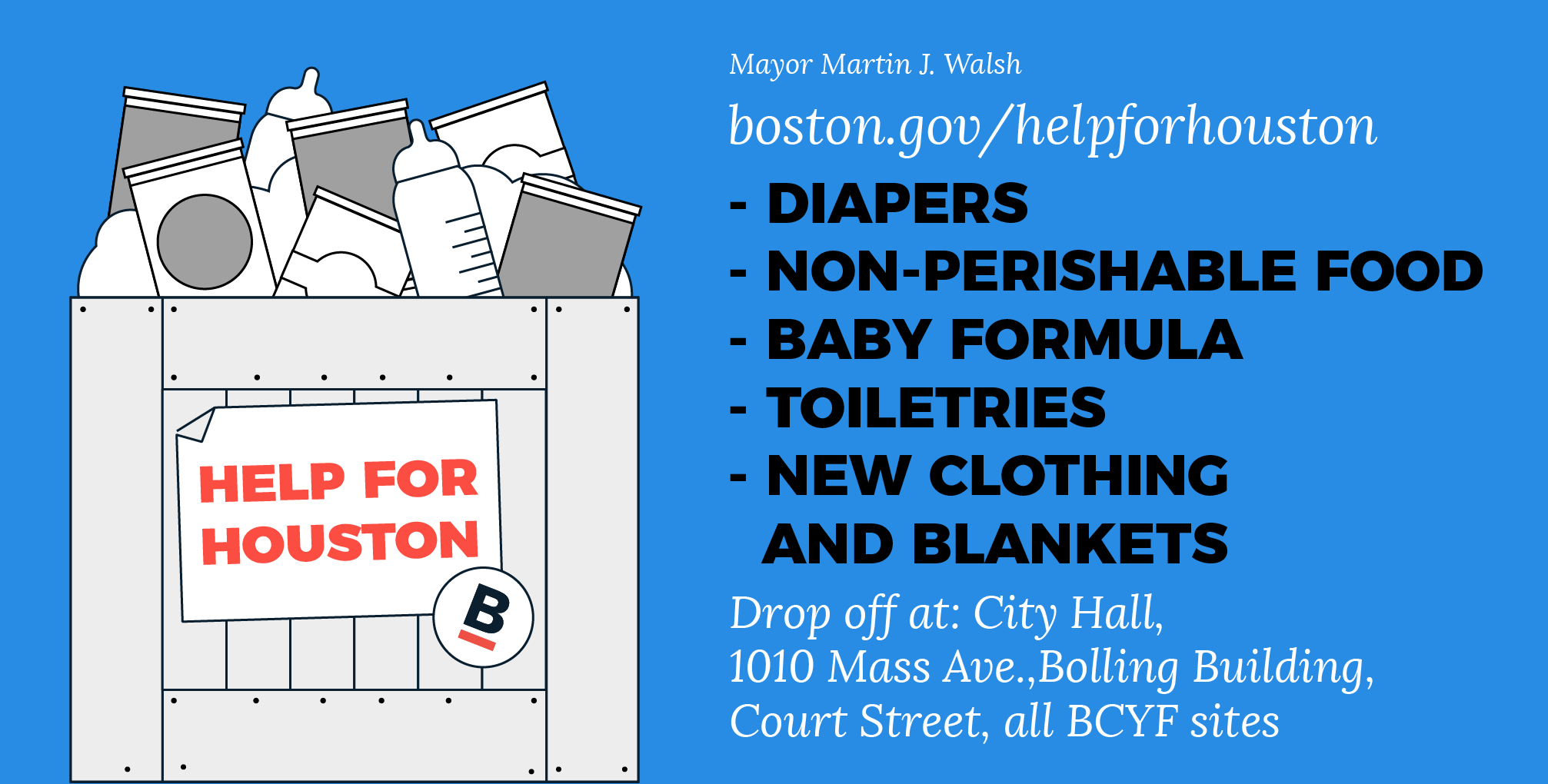
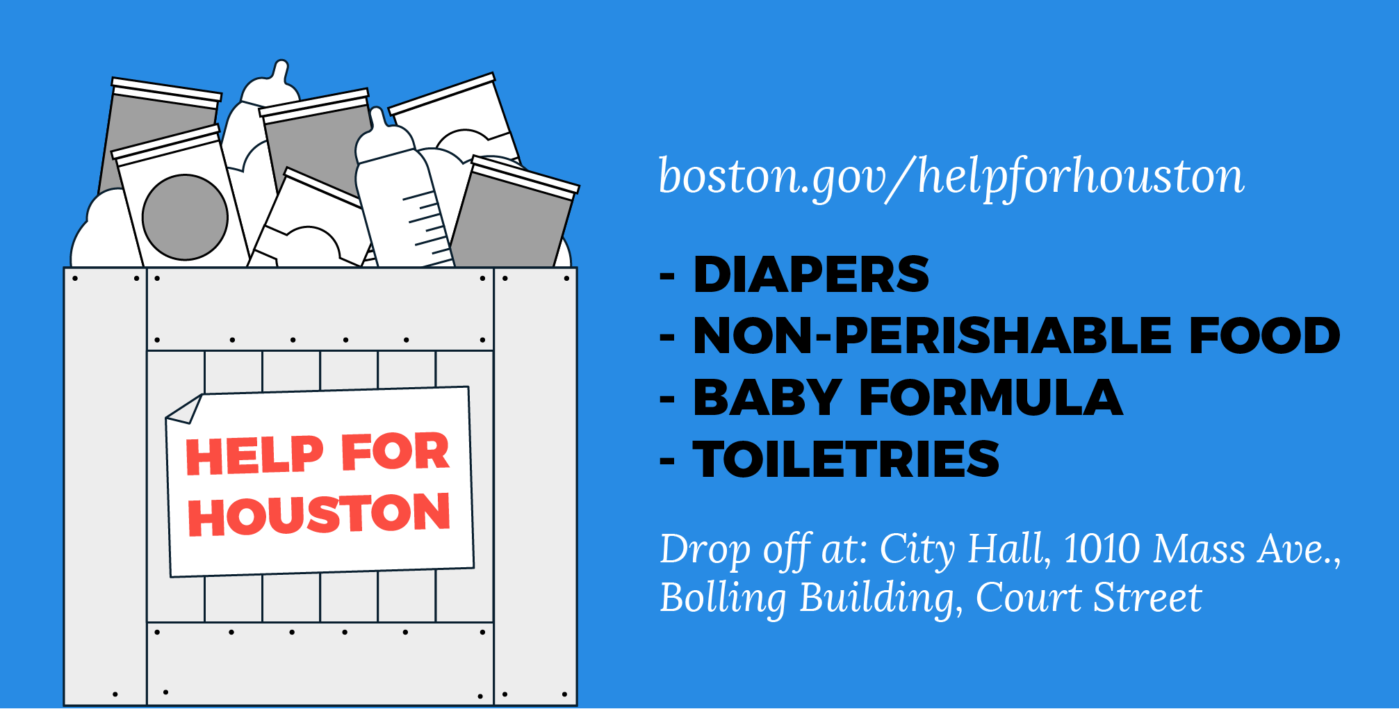
Recently, we held a Help for Houston Drive for those affected by Hurricane Harvey. We had a tight timeline to hold the drive. Getting the word out to Boston and beyond had to be quick and efficient.
Within just a few hours, we were able to create online graphics and physical posters that were blasted out to the public. We shared these through multiple social media accounts and across the City, and every graphic and poster stayed consistent to our brand.
Even when the need for certain supplies changed, we were able to easily update the content of our graphics and stick to the brand. We didn’t have to debate color schemes and font decisions. All we had to worry about was getting the right information out.
Having one distinct brand also meant that when you saw one of our Help for Houston graphics or posters, you knew that information was coming from the City. We hope that instant recognition also helped people react quickly to our drive effort.
We couldn’t have asked for a better result from our Help for Houston work. Throughout the week, donations poured in. Volunteers filled 10 trucks carrying 250 tons of supplies and donations. It was an incredible feat that wouldn’t have been possible without the help of the public. So, thank you!
This was a busy time. Coordinating so many moving parts in a drive like Help for Houston can be hectic, and Emergency Management had a lot on their plate spearheading the effort. But, by staying true to the City of Boston’s brand, we were able to make sure all of those moving parts were connected. We wanted to give you, Boston’s residents, the confidence to know you were donating to a worthy cause. The City’s brand helped us accomplish that goal.


